Title design blog
.jpeg)
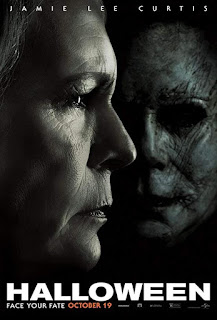
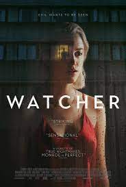
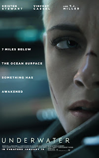
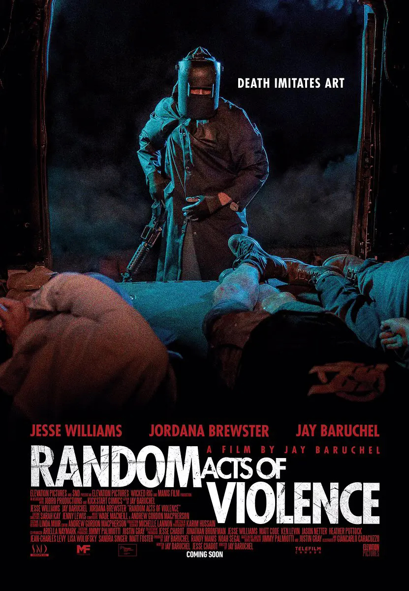
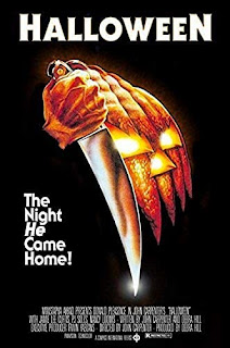
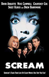
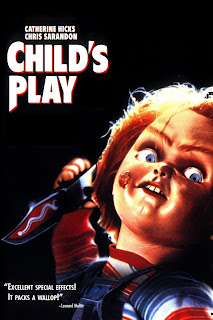
For the opening credits to our film, the font that we would like to use will be ITC Serif Gothic Heavy that passes by in the background, such as in a moving scene, or in a still scene where it will most likely appear and disappear as the scene changes. The credits will have a black color with perhaps a red undertone to give that ominous and a slight feeling of unease. The trigger for the credits will most likely be a cutaway or during a tracking shot. We will most likely title our film “Syrian” or “Blue.” The title will be shown in big bold letters to make it stand out. Our plan is to have the title in a red color if its “Syrian” and in blue if it’s called “Blue.” Normally, the names of the person under a certain job will be larger, as well as the name of the position will be in bold such as if the person is a producer, it will be (12 font) Production by: (18 font) [Person]. Our main program usage will consist of many Adobe Products, such as Adobe Affects and Adobe Premier. This ...
.jpg)
.png)

.JPG)
